In this article, we'll learn how to build reusable UI components in React and Tailwind CSS which can save us time and improve our workflow.
Prerequisites
To set up this project we need Vscode and Nodejs to help us with all the dependencies we need.
Section 1: Setting Up The Project
For this project, we shall be using Vite. Vite is a lightweight development server built on top of native ES modules.
Step 1: Install React And Tailwind With Vite.
Just follow this guide and you'll be ready to hit the road in no time.
Step 2: Add CVA To The Project
CVA stands for class-variance-authority, it's a library that allows us to use Tailwind CSS classes in our React components elegantly and efficiently. It makes it easy to add styles to components by allowing us to directly use Tailwind classes in JSX. This means we don't have to manually create CSS classes or use inline styles to add styles to components.
To install CVA in the project:
npm i class-variance-authority
import { cva } from "class-variance-authority";
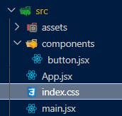
File Structure
This is the file structure for the project:

Section 2: Building A Reusable Button Component
Step 1: Create A Button Component
In the button.jsx file, add this simple code snippet.
import { cva } from "class-variance-authority";

default function Button() {
  return (
    <button>Button</button>
  )
}
This here is the basic structure of our component. It renders out a plain old button.
Step 2: Create Button Variants
With this next step, we're going to add variants that allow us to manipulate the button through props. We're gonna add variants for each of the button style properties: intent (primary, secondary, tertiary), size (small, medium, large) and roundness (square, round, pill). We are also going to add a default variant too.
Add the following lines of code to button.jsx file:
const ButtonVariants = cva(
    /* button base style */
    "h-fit text-white uppercase transition-colors duration-150",
    {
        variants: {
            /* button colors */
            intent: {
                primary:
                    "bg-green-500 hover:bg-green-600",
                secondary:
                    "bg-red-500 hover:bg-red-600",
                default:
                    "bg-gray-500 hover:bg-gray-600",
            },

            /* button sizes */
            size: {
                small: ["text-sm", "py-1", "px-2"],
                medium: ["text-base", "py-2", "px-4"],
                large: ["text-lg", "py-4", "px-8"],
            },

            /* button roundness */
            roundness: {
                square: "rounded-none",
                round: "rounded-md",
                pill: "rounded-full",
            },
        },

        // defaults
        defaultVariants: {
            intent: "default",
            size: "medium",
            roundness: "round"
        },
    }
);
With this code, we've added some options under the hood of our button that'll give it a custom look and feel. We can now tailor the button by manipulating its props.
Step 3: Add Props To The Button
Now that we've got our options set up, it's time to add them to our button. We're gonna refactor the button component to add props for intent, size, and roundness and then pass them as props to ButtonVariants which then converts them to the appropriate tailwind utility classes.
Rewrite button.jsx :
export default function Button({ intent, size, roundness, children }) {
    return (
        <button className={ButtonVariants({ intent, size, roundness })}>{children}</button>
    )
}
With this step, we've added the options we created earlier to the button component. Now we can use them to customize the button to our liking.
Step 4: Output The Component
Now, It's time to test out our custom button and see the results in our browser.
Import the button component in app.jsx file and use it in the application.
import Button from "./components/button";

function App() {
  return (
    <div>
      This is a small rounded primary button: <Button intent="primary" size="small" roundness="rounded">Button</Button>
    </div>
  )
}
open the integrated terminal, type in npm run dev :

To see more, Rewrite app.jsx :
import Button from "./components/button";

function App() {
  return (
    <div className="h-screen space-y-8 px-4 flex flex-col justify-center items-center">
      <h1 className="text-slate-800 text-2xl font-bold">Reusuable Button Component</h1>

        <div className="space-y-2">
        <h2 className="text-slate-800 text-lg font-    bold">Default</h2>
        <Button>Default</Button>
      </div>
      <div className="space-y-2">
        <h2 className="text-green-500 text-lg font-bold">Primary</h2>
        <div className="flex items-center gap-4">
          <Button intent="primary" size="small" roundness="square">Small</Button>
          <Button intent="primary" size="medium" roundness="round">Medium</Button>
          <Button intent="primary" size="large" roundness="pill">Large</Button>

        </div>
      </div>
      <div className="space-y-2">
        <h2 className="text-red-500 text-lg font-bold">Secondary</h2>
        <div className="flex items-center gap-4">
          <Button intent="secondary" size="small" roundness="square">Small</Button>
          <Button intent="secondary" size="medium" roundness="round">Medium</Button>
          <Button intent="secondary" size="large" roundness="pill">Large</Button>
        </div>
      </div>
    </div>
  )
}

export default App;
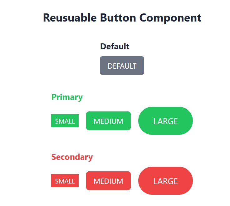
We get this:

There are so many more reusable components that can be used, like cards, forms and so on.
Conclusion
Reusable UI components are an essential part of building efficient and maintainable applications. By utilizing React and Tailwind along with CVA, we can create reusable components that not only save time but also give our app a sleek, professional look. By creating reusable components, we are not only increasing our productivity but also making it easier for team members to collaborate and add new features to our application.
If you like to connect with me, you can reach out on Twitter || LinkedIn || GitHub || Portfolio.
Till next time.
Link to GitHub repo: ajax484/react-tailwind-cva-reusable-components (github.com)
cover photo: Pixabay from Pexels
